Experience Better: The CX Podcast · 2026-06-04 · 23 min
Key moments - from our scoring
Substance score
56 / 100
Five dimensions, 20 points each
Kubra's Senior Director Aaron Skourty, Senior Product Marketing Manager Sarah Small, and Senior Graphic Designer Matt DeDarosa discuss actionable insights from a survey of over 1,000 primary household decision-makers about utility bill preferences. Despite widespread autopay adoption, 69% receive bills via email and 58% still receive paper versions, with 77% of paper recipients actively reviewing them. The five-minute window is critical: customers prioritize amount due (83%), bill due date (63%), and usage information (58%), while finding payment method options and assistance program details distracting. Design challenges stem from bills evolved over decades that attempt to communicate everything at once, creating cognitive overload. Key trends show customers increasingly demand transparency and contextual data - comparing usage to previous periods, similar properties, and weather impacts. The discussion emphasizes that bill redesign need not require full overhauls; targeted refreshes addressing visual hierarchy, information hierarchy, and personalization can significantly reduce customer service calls and boost digital adoption. Sarah Small highlights that rising utility costs (up 40% in five years) mean many customers cannot rely on autopay alone and actively need to understand their bills for financial planning.
77% of paper bill recipients actively review their bill when they open it, and despite 69% receiving bills via email and widespread autopay adoption, 58% still receive physical paper bills, indicating that bills remain a significant customer touchpoint.
75% of consumers spend five minutes or less reviewing their bill, and 17% spend just one minute, yet only 38% can immediately find what they need, creating a significant usability gap.
Customers prioritize amount due (83%), bill due date (63%), and usage information (58%), while 40% find payment method options distracting, 40% see little value in term definitions, and 31% consider assistance program details less important.
Good bill design reduces cognitive load through visual hierarchy, contrast, and flow; 44% of customers report important details are scattered throughout, so utilities should prioritize critical information front and center within the five-minute window and use visual indicators and color-coded sections.
Customers increasingly demand transparency and contextual data, such as usage comparisons to previous months or years (63% find most useful), similar properties, and weather-adjusted benchmarks, signaling a shift toward more personalized and detailed bill experiences.
Our reviewer’s read on each dimension, with quotes from the episode.
The episode delivers moderate insight density with some useful data points (77% of paper bill recipients actively review bills, 75% spend ≤5 minutes, 38% immediately find what they need) but relies heavily on surface-level observations and design platitudes rather than novel strategic insights. The conversation about bill redesign principles is standard practice stuff that B2B operators in utilities would largely already know.
75% of consumers said that they spent five minutes or less reviewing their bill
only 38% said they can immediately find what they need
The episode recycles well-established CX and design thinking frameworks (cognitive load, visual hierarchy, personalization, simplicity) without fresh angles or counterintuitive takes. The recommendations - simplify bills, prioritize key information, use visual design - are conventional wisdom in billing and customer experience. No contrarian or first-principles arguments emerge.
Simplicity is key
good design isn't about making it prettier. It's about reducing cognitive load with good use of basic design principles like contrast flow and visual hierarchy
The guests are internal Kubra staff (a Senior Director, Senior Product Marketing Manager, and Senior Graphic Designer) with relevant hands-on experience in billing and design, but they are not recognized industry leaders or operators at scale outside their own organization. They lack the seniority or external validation of someone who has driven transformative change at a major utility or across multiple utilities at enterprise scale. This is a vendor's internal perspective, not a neutral practitioner expert.
Sarah Small. Sarah is a senior Product Marketing Manager for Billing and payments
Matt DeDarosa joining us. Matt is Kubra's Senior Graphic designer
The episode provides concrete research data (1000+ survey responses, specific percentages like 77%, 75%, 38%, 63%, 59%, 40%, 31%) and real examples (two-state redesign project with regulatory language challenges, comparison of rate tiers on a utility website). However, it lacks named utility clients, specific financial impact metrics, case study details with measurable outcomes, or precise timelines for implementation. The evidence is survey-based but not accompanied by dollar figures or concrete before/after performance data.
Our recent bill redesign consumer survey we launched in April. We received over 1000 responses from primary decision makers in the home across the United States
I recently worked on a redesign project for a client that covered two states. They had a lot of different payment agreement programs
The host (Aaron Skourty) asks reasonable questions and occasionally pushes back thoughtfully (e.g., questioning the gap between 77% active reviewers and 38% finding what they need immediately, or probing the tension between targeting vs. regulatory requirements). However, most questions are softball follow-ups that allow guests to elaborate without challenge. No disagreement surfaces, no tension is productively explored, and the conversation never ventures into difficult tradeoffs or limitations of the recommended approach. The host also includes obvious self-promotion for Kubra at the end.
That gap seems quite large, Sarah
Yeah, and honestly, Sarah, this may go even beyond the affordability, and it may eventually come down to also having a sense of control
Computed from the transcript - who did the talking, and the words that came up most.
In this episode of Experience Better, guest host Erind Shkurti is joined by KUBRA experts Sara Small and Matt DeLaRosa to explore findings from the new 2026 Bill Redesign Insights and Preferences Report. Together, they unpack how today’s consumers interact with their utility bills, what information they value most, and why utilities are increasingly rethinking the customer experience behind both print and digital billing. From surprising insights about how little time customers actually spend reviewing their bills to the growing demand for clearer usage information and simpler layouts, the conversation reveals what utilities need to prioritize to keep customers informed and engaged.
Transcribed and scored by The B2B Podcast Index.
Speaker A: Okay. Hello, everybody, and welcome to Experience Better the CX Podcast brought to you by Kubra, where we explore the ideas, the research, and real world strategies that shape how builders connect with the people that they serve. I'm your guest host, Aaron Skourty. I'm a Senior Director of Client Solutions here at Kubra. In my role, I work closely with our utility clients every day, helping them solve real challenges around billing, payments, and customer communications. And one of the questions we hear a lot at Kubra is, how do we make our bill better? Well, that question is exactly what today's episode is all about. And I'm thrilled to have two Kubra experts in the room to help me answer it. So first we have Sarah Small. Sarah is a senior Product Marketing Manager for Billing and payments. Sarah is behind the research, uh, that we're going to be digging into today, which gives us a fresh and data driven look at what consumers actually want to see on their utility bill. Sarah, thanks for being here.
Speaker B: Thanks, Arendt. I'm excited to share some interesting data with you today.
Speaker A: Awesome. Looking forward to that. And on the other side, we've got Matt DeDarosa joining us. Matt is Kubra's Senior Graphic designer. Matt brings the visual side of all of this to life. When clients are ready to redesign their builds, Matt is the one translating consumer preferences and data insights into real and tangible design decisions. Matt, it's great to have you as well.
Speaker C: I'm happy to be here. Thanks for having me.
Speaker A: Okay, so today we're, uh, taking a look at findings from the 2026 bill redesign insights and Preferences Report, which is fresh research that tells us who's reading the utility bills, what your customers care about, what's frustrating them, and what a smarter design could mean for both your customers and your organization. So with that, let's dig right into it. So, Sarah and Matt, um, as you may have noticed, we're living in a world where many of us autopay everything and never look twice. You can think of streaming subscriptions, bank statements. I'm curious whether the utility bills are actually any different. So, Sarah, I'll start with you. Um, what does this research show us and why are we seeing so many utilities start to take a harder at how their bill is designed?
Speaker B: So the reality is that, so even with autopay and other digital tools, consumers are still receiving their bills and statements, right? About 69% receive them by email, and surprisingly, 58% still receive them by paper. So we know that while there is, yes, a clear shift to digital tools and engagement, there still remains quite a significant opportunity to connect with consumers through that bill, both the digital and the paper versions. 77% of paper, um, consumers, they actively review their bill when they open it.
Speaker A: Yeah, that number that you just mentioned, Sarah, that 77% of paper bill recipients actively review their bill. That seems actually much higher than I expected.
Speaker B: Yeah, it is pretty high. And so my question would be, why aren't all utilities taking a hard look at their bills and how they're designed? There are so many opportunities to boost the customer experience with a bill. Reducing inbound calls, driving program adoption, removing confusion around payment. These all can be supported with a bill redesign. So at the end of the day, it's worth the investment. And just another note to add, many consumers today, they're facing affordability concerns. Household utility costs are rising by over 40% or they've risen by over 40% in the last five years. So not everyone has that luxury of setting up autopay and not looking at their bills every month. Some consumers need to make hard decisions, and that bill still remains quite important to them.
Speaker A: Yeah, yeah. And honestly, Sarah, this may go even beyond the affordability, and it may eventually come down to also having a sense of control. Um, when you think of a payment obligation, um, that can vary month over month, which is very, very typical in the utility space. When you think about that, I personally, as a user, would actually want to see what I'm paying before I pay. And that can especially be true if you're talking about programs such as autopay that may not necessarily have guardrails or thresholds that can cap the max amount that can go towards a payment. So I can certainly see the tendency there that people would probably want to see their bill before they engage in any of the programs like autopay, for instance. So that's really interesting. Okay, so, Matt, um, as a person responsible for our client builder designs here at Kubra, uh, you've probably seen more utility bills than most people ever will. Um, we know that utilities generally want to serve their customers well, so why do so many bills still fall short? What do you see when a client first brings their utility bill to the table, Matt? And are there things or patterns you're seeing in, uh, the client's print and digital bills? From a design perspective, yes.
Speaker C: A lot of the problems utilities are trying to solve center on customers understanding of their bills. Sometimes it's about confusing rate structures. Sometimes they just want to know why their bill seems higher than they think it should be. Uh, this can lead to an uptick in Call volume and a lower overall satisfaction rate. Good design can alleviate some of that frustration by making the information on the bill approachable and easier to understand. Example, I recently worked on a redesign project for a client that covered two states. They had a lot of different payment agreement programs that required specific language from their respective regulatory boards. Uh, the client informed me that a large number of their customer service calls were related to confusion around those programs. So during the redesign, we took the opportunity to re examine how these things were displayed. Uh, we removed redundancies, added context, resulting in a more concise, clearer layout.
Speaker A: M. Yeah, yeah, good. Okay. So, Sarah, we've established that, um, build design matters and that it's often overdue for a refresh. Um, I want to ask you about something in the research that I think will really surprise our listeners when it comes to how much time consumers actually spend with their bills. Um, what did you find?
Speaker B: So, five minutes. 75% of consumers said that they spent five minutes or less reviewing their bill, and 17% said even less. Just that one minute. That's all they give their bill. So in those five minutes, only 38% said they can immediately find what they need. 50% of consumers find themselves scanning for key information, and nearly 1 in 10 said that they often feel confused when they open their bills. Presenting a bill that's easy to navigate and understand goes much further than just convenience for the customer. It builds trust between the utility and the customer. When a customer has a strong relationship trusts their utility, they're more likely to engage in programs, read the communications, and take action. So it's both to the benefit of themselves as well as the utility.
Speaker A: That's interesting. Uh, when you say that, ah, only 38% of consumers immediately find what they need, which seems surprisingly low, especially since We've established that 77% actively review their bill. That gap seems quite large, Sarah. Absolutely.
Speaker B: It was surprising to us as well. It's no wonder that only 10% of consumers feel in control when they see their bill. They can't even find what they're searching for right away.
Speaker A: Yeah, yeah, that certainly sounds very actionable. And we will be talking about some of that action later in the podcast. Uh, but before we get into that, uh, I want to make sure that we understand who we're actually designing for. So, Sarah, the report includes some really interesting demographic and channel data who responded to the survey, and what does that tell us about the range of customers that utilities need to be thinking about?
Speaker B: Yes. So at Kubra, we love our research. We do our best to support Utilities with the latest consumer data to capture their preferences for billing, payments, and communications. Our recent bill redesign consumer survey we launched in April. We received over 1000 responses from primary decision makers in the home across the United States. When we filtered down the data that we gathered by age, there were a few differences, and I'll share some with you. So bill reception by email decreases with age, while reception by physical mail increases with age. So not really a surprise there. The older the demographic, they're more likely to have that paper bill. So when you're thinking about promoting, um, e bill adoption, you're going to want to focus on those older generations. Now, we also saw a preference to receive utility communications by email, so as opposed to inserts or on bill messaging. And that's pretty consistent across all ages, and it sits around the 50% mark. So focus on email communications. And then one more stat. I don't want to give too much away before we publish our full report, but, um, it's the 18 to 29 age range that struggles the most with understanding their usage and what they're paying for. Hmm.
Speaker A: Okay. So we know that customers give five minutes or less, and we know who those customers are. The next question that comes to mind is what should a bill actually do in that window? So, Sarah, uh, what does the data tell us about how customers move through a bill and what they're prioritizing?
Speaker B: So when we approach a bill, the front page is prime real estate, Right? So we assess the current layout, we determine where we want to place the different fields. Um, it helps to understand what customers are looking for and what elements they find to be distracting. Remember, we only have those five minutes to communicate and drive action. So when we ask consumers which items they value the most on their bill. I mean, I wish I had some more exciting insights here, but there weren't many big surprises. 83% agreed. Amount due was the most important. They want to know how much is due. Bill due date came in next at 63%. So tell me what I owe and when it's due. And then third was usage information at 58%. Now, uh, on the flip side, we asked, you know, what items are less valuable and do you find to be more of a distraction? These were a little bit more surprising. I would say. 40% said they could do without the different ways to pay. I know. Um, 40% also see little value in the term definitions. And 31% said that assistant programs, assistance programs, and those details were not as important to them. So while these are considered not the most important elements Sometimes you can't really get around it. And for many, having some of that information about payment options assistance availability is still important. So you have to kind of find a good way to manage all of this information.
Speaker A: Yeah, yeah, I can, I can definitely see the amount due and the due date being at the top of the list. And, and really when you think about that, Sarah, at the end of the day, um, you get a bill because you have an obligation to pay. And if you have to pay, well, guess what, you're going to need an amount due and a due date potentially. Um, however, what I find personally interesting is the ways to pay that. It appears to be more of a distraction and just from personal experience here, um, and this does not quite matter if it's the printed bill or the web, the ways to pay is actually one of the items I usually scan to see if my preferred method of payment is available. Um, with, you know, let's just bring my utility. Um, the. They will go unnamed. I love them very much. Uh, but one of the things I do every time I get a bill from them, I'm always scanning is my preferred method of payment there. And unfortunately they're not offering that. But it's always one of the first things I look at when I'm scanning my bill monthly.
Speaker C: So rather than removing these items, and we know that some regulations require the terms and definitions, for example, we find a better place for these items to lend. Uh, it can be online. And we suggest ways to guide customers to their online resources or move them to a part of the bill that where it's better fit in the hierarchy of information.
Speaker A: Yeah, and that brings potentially another element here, Matt, um, which could be target messaging. Um, take for example, uh, the other data point that Sarah mentioned where 31% said that Assistant programs details were not important to them. Well, uh, you don't need, uh, to show everything to everyone. And in the case, uh, of the assistant programs, for example, um, you can just show that to someone, uh, who may have fallen behind in payments or perhaps that if they had, uh, bounced payments, uh, or there could be different eligibility criteria. Uh, so there's definitely something to be said about targeting. Um, a lot of that can be achieved, and I do this day in, day out with our clients when we code their bills, when we implement processing rules. Obviously if you've got the data, it's very easy to code that in. Uh, but it's certainly, uh, a point to think about when you're designing the bills is, well, don't show everything to everybody.
Speaker B: Absolutely so if your utility has access to this data, it can make a very big difference in how you can communicate with your customers. A more personalized bill will absolutely have a greater impact on the customer experience.
Speaker A: Yeah, absolutely. Absolutely. Sara. Okay, so, Matt, uh, I'll switch to you, um, hearing Sarah talk about what customers value and what distracts them. Um, as a designer, where do you even start? What design decisions are you making to get a customer to what they need in those five precious minutes?
Speaker C: Well, a lot of client bills evolved over decades. Instead of being intentionally designed, uh, sometimes we still see bills trying to communicate everything at once, which means customers absorb almost nothing. Uh, 44% say important details are scattered throughout, and there's too much on one page. So good design isn't about making it prettier. It's about reducing cognitive load with good use of basic design principles like contrast flow and visual hierarchy.
Speaker A: Yeah, and it's very true about the cognitive load. Um, and this does not really matter if it's on the printed side or if it's on the design side. And honestly, generally speaking, um, that is not as top of mind as it should be when you are designing an experience. Um, but we know, and this has been well studied and well documented, um, we know that the human brain processes visual information significantly faster than text. Uh, so we are visual creatures. Uh, and it can certainly help, Matt, uh, as you say, making things a bit more visual, more graphical, for instance. It can certainly help better and faster parse information and comprehend what's on the bill. Yeah, that's a really good point. Uh, okay, so let's take a look ahead. Um, the report isn't just a snapshot of where things stand today. It's also giving us signal about, uh, where customer expectations are heading. So, Sarah, uh, what does the data say about what customers are going to want from their bill in the near future?
Speaker B: The trend that we're seeing among utility customers and their preferences is transparency. Customers are no longer dissatisfied with simple explanations of their charges. They're looking for more context. This shifts our focus as designers to a, uh, more detailed chart and some more comparisons to offer app. This is the type of information that will elevate a bill experience to feel more personalized. And again, with that personalization comes trust. It looks like usage today compared to last month or last year. 63% of consumers find these two to be the most useful. But we're also seeing consumers look for deeper comparisons. So this is their usage compared to the usage of customers with similar properties or the average temperatures and the impact it had on their usage. These all come from data. So that's the first place to start when utilities are considering moving forward with more transparency in the usage.
Speaker A: Yeah, absolutely right Sarah. And I'm thinking this might need to go even further. Um, as in could the needle move from providing insights to actually taking proactive action? Uh, for example and I'll use myutility again, I love them very much. Um, they offer uh, three rate time of use, uh, tiered pricing and overnight pricing. They also offer an informational comparative module on their website that lets you see what your usage of the last billing cycle would have been or could have cost you under each tier. Which by the way is super awesome. I absolutely love that. But when you think about that you're wondering, well it's great you're offering that, but could you just take that one step further? Like could you just maybe proactively put me on a tier that would cost me less? Um, so that can be an angle where take the insight to actual proactive action. And obviously when you think about that utilities uh, operate in a heavily regulated environment. So some of that might need user uh, consents but there could be users like myself who could easily pre consent uh to adopting or opting into some of that more proactive action. So I think uh, especially in this day and age uh Sarah, with the event of AI and the adoption of AI and analytics and uh, it's very important that actually uh, we think about, we collectively ourselves and our clients think about how do we make that leap more effectively from insights to actual proactive um, action. Okay so well with that we are getting close to the end of our conversation and I want to make sure that every utility professional listening walks away with something very concrete. So Sarah and Matt, if someone's listening to this episode on their commute and they're thinking okay, we need to do something about our bill, what do you want them to remember? And Matt, I'll start with you first.
Speaker C: Well that's easy. Uh, full redesign isn't always necessary. So a targeted refresh can really go a long way to help. Focus areas can include branding, alignment, addressing key pain points. For example, 40% of consumers struggle to understand their usage and ensuring the most critical information is front and center within that five minute window.
Speaker A: Okay.
Speaker B: And Sarah, so a simple, well designed bill is one of the most effective and lowest lift customer experience improvements available to utilities and even other billers. The impact of a redesign extends to both customer experience and the bottom line. There are ah, postal savings opportunities through smarter layouts. And page optimization. And there are opportunities to drive digital adoption with a bill experience that customers prefer and they find more personalized and attuned to their needs. I'll also add another bonus takeaway. Simplicity is key. 59% like visual indicators and color coded sections, but utilities should be working towards simplifying the bill. In general, 57% of your customers want a simpler bill layout. And when they open your bill, remember they only want to spare five minutes.
Speaker A: Yeah, so that sounds great. Thanks for the points Matt and Sarah. Um, thank you for both of those takeaways. I'd like to offer one as well. Um, build redesign and implementation go hand in hand. So having a vendor who handles both Wink Wink Kubra uh, creates a smoother process and a better end result. So for any of our clients listening who uh, may be considering a build redesign or build refresh in the future, uh, definitely reach out to your client success manager to get that conversation started. Uh, we would absolutely love to help you out. And for anyone else who just wants to go deeper on this topic, um, just know that we will be publishing the full 2026 build redesign insights and Preferences report on our website@www.kubra.com. stay tuned for that because what you've heard today is just your sneak peek. So Sarah and Matt, this has been a fantastic conversation. Um, thank you both for bringing this research life and for making this topic of build redesign feel genuinely exciting. Thank you.
Speaker C: Thanks again for having me.
Speaker A: Okay everybody, uh, until next time, I am Aaron Scourty and this has been Experience Better the CX Podcast by Kubra Sam.
Other episodes covering the same guests and topics, from across The B2B Podcast Index.
 Burnout: Why Thought Load, Not Workload, Is Draining You with Liane DaveyBeyond the To-Do List · on Cognitive load95 / 100
 Digging Deep Into Geothermal with Mike Richter from Brightcore EnergyRenewable Energy SmartPod · on time-of-use pricing89 / 100
 50: How Boutique Consulting Firms Scale for a Successful Exit with Martin MehalchinThe Consulting Growth Podcast · on Customer Experience (CX)87 / 100
 The Model That Creates Lifelong Customers (and Revenue)Experts of Experience · on Customer Experience (CX)80 / 100
 SaaS as an Orchestra | How to conduct CX, content & AI into one seamless journeySaaS Stories · on Customer Experience (CX)78 / 100
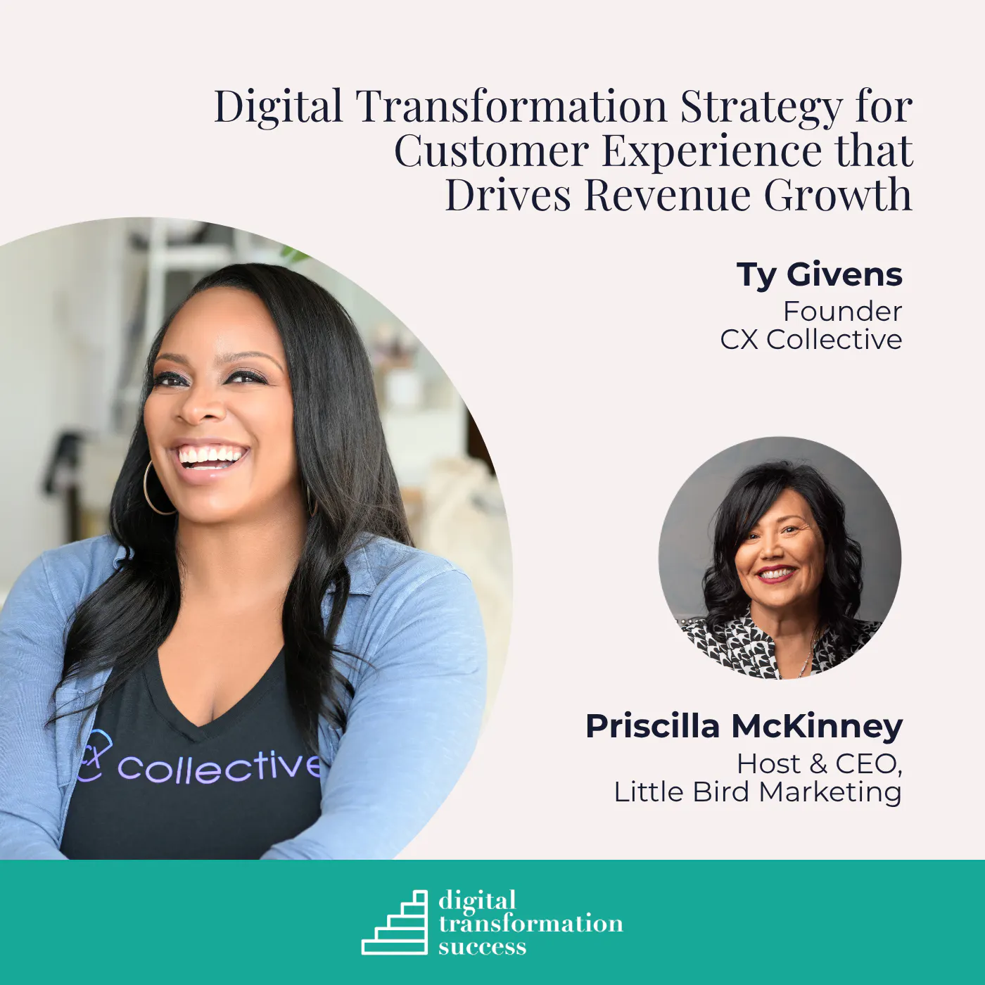 Digital Transformation Strategy for Customer Experience that Drives Revenue GrowthDigital Transformation Success · on Customer Experience (CX)76 / 100E-Bill Adoption Strategies That Actually WorkAre Digital Wallets Ready to Take Over Bill Pay in 2026?Lessons Learned From the Latest Storm SeasonA Practical Guide to Customer Journey MappingNavigating Outages and Driving Sustainability: A Roadmap for Utilities